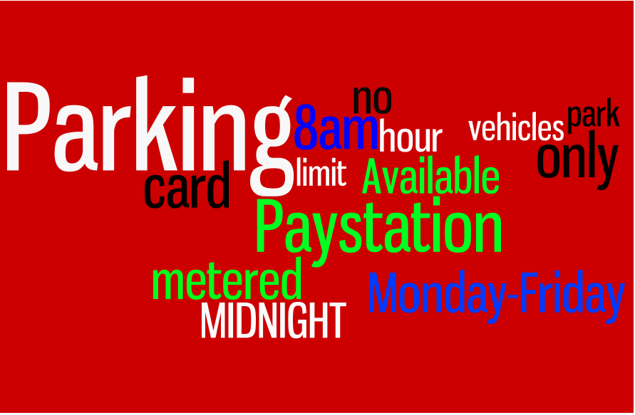
Have you ever driven around and noticed a road sign in the corner of your eye, but you couldn’t really read what it was about because you passed it too quickly and there were too many words on it in different font sizes? The kind of road sign that when you pass it, it looks more like a wordcloud than an actual information sign?
Okay, maybe I’m exaggerating a bit, but some signs really need an update. I believe motorists should be able to understand signs at a glance. And that is probably the same idea council member Garoknick of New York City had in 2011 when he first announced that something had to change with the city’s parking regulation signs.
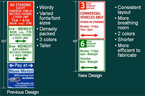
6,300 parking signs in Midtown and Lower Manhattan will be replaced with new ones. The old parking signs were too hard to understand and read. Different fonts, colors and font sizes were used on the signs making them harder to read for motorists. Also the phrasing was confusing at some of the signs, making them even harder to understand.
Confusing signs and signs that are hard to read and understand cause stress to people trying to find a parking space. It also congests traffic because people will have to slow down or even stop their vehicle to look at the signs.
The new parking regulation signs are a simplified version of the old ones. The phrases are adjusted making them easier to understand and there is a clear lay-out chosen. There is a standard two color scheme that is used on all of the signs. Also the amount of text on one sign is reduced.
Below you can find an image (from the NYC DOT press release) that compares the old signs with the new ones. Aren’t they a lot better?


